Bigger Please: the New York Times Redesign
Two weeks ago the New York Times launched a redesign of their website. While not a complete overhaul of all templates, the Times made some important changes to their article pages. The design is cleaner, uses more whitespace and more visuals – inviting users to read. Mashable has a comprehensive write-up on the redesign. I want to show how the New York Times could have gone one step further to make reading their articles even more enjoyable.
Design patterns for reading
These are some of the patterns which make for a good reading experience:
- Use a single column of text, with ample whitespace.
- Use the right font size. Anything below 16 pixels is too small. Bigger probably is better, as screen densities (ppi) increase.
- Choose a comfortable measure: “The 66-character line (counting both letters and spaces) is widely regarded as ideal.” (From The Elements of Typographic Style by Robert Bringhurst. Some of the principles in the book and how they apply to the web have been compiled here.)
- Minimize distractions from sidebars, navigation and other elements.
- Use a vertical layout. Scrolling is fine. Do not divide your article into pages if the page does not correspond to a logical section like a chapter.
De Correspondent and Medium are two different websites which are following these principles with the interests of their readers in mind.
How does this apply to the NYT redesign? Have a look at this article about Hiroo Onoda. The design uses a single column, ample whitespace, vertical layout (mostly), single pages for articles, minimal distractions: perfect on those counts. Where they could improve is font size and measure.

In the paper edition NYT Cheltenham is used for body text. On the site it is only used for headers; body text is set in 16 pixel Georgia. I would guess that Cheltenham is less readable at that size. The solution of course would be to increase font size.
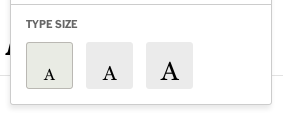
Georgia, in itself a solid choice for online reading, at this size also gets uncomfortable for more than a few paragraphs. The web site does offer tools to increase font size. Often tools like this allow you to increase and decrease the font size.

Sensibly the NYT interface only offers two choices up. The first size up looks fine.

Now compare the two screenshots: the font size increases, but because the column width stays the same the measure decreases. The first line had 70 characters as a default, which is a good measure. One size up creates a measure of 56 characters. The third font size leads to 44 characters.
Font scaling in this way defeats its purpose. These tools create problems instead of solving them.

A minor concern in the redesign is placement of smaller images inside the text. You can see how the image is squeezed in between the text. Also, the caption is smaller than needs to be.
You cannot cater for every reader and every preference, but I believe the default font size choice should have been smarter. Increasing font size should not be necessary.
In this time, when online reading is increasingly popular, bolder moves are needed to make sure we keep reading. Especially by newspapers.
If you are still having doubts about generous font size, please read this convincing argument by Oliver Reichenstein of Information Architects.