Please Make Me a Standards Manual
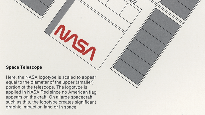
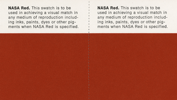
A few months ago the news about this was in nearly every design blog and feed available: a reissue of the NASA Graphics Standards Manual from 1976 was put up on Kickstarter. It took just over a month for the project to get funded, and the manual will soon be printed.

In the words of the initiators, Pentagram designers Hamish Smyth and Jesse Reed: ‘As design nerds, we think the Worm is almost perfect, and the system behind it is a wonderful example of modernist design and thinking.’ The Worm is the affectionate name given to the seventies NASA logo. You can read the rest of the rationale behind the reissue on the Kickstarter page.
The whole thing fascinates me on several levels. Who are the people backing the project? Why would you want to possess such a utilitarian out-of-print publication like this? And why is this getting so much attention?
That it is about NASA helps a great deal of course.1 And most of the backers undoubtedly are design nerds themselves. Most probably designers as well.
After all it is their job to create visual identities like the one described in the manual (consisting of logos and other graphic elements, rules for typography, etcetera) and to make stationery, websites, brochures, magazines, books, etcetera, etcetera, etcetera. Imagine being a member of this select group. Lots of professionals follow the rules made up by others. Usually this is not how designers work: creativity is often seen as reinventing the rules. If you are a designer, not following rules is expected of you. If you only applied the rules, clients would say: ‘Did you see how our designer just made every sample exactly the same? Where is the creativity in that! I could do that! My mailman could do that! My four year old could do better!’
Or could they? Let’s assume that everyone was creative. Things would quickly get out of hand. The world would consist of a lot of four-year-olds. Nothing would get done and costs would spiral. This would be untenable and would endanger a free market economy. So, on the one hand you have creatives; on the other hand there is the need to earn money. Something’s gotta give.2

To ensure that every possible design permutation fits within the same style, you would have to describe the very nature of them all. In other words, you would have to define the boundaries. The resulting set of rules governs designer behaviour and at the same time solidifies client expectations.
Consequently both parties profit. Designers promise clients to be creative only where it counts, so the end result will be consistent. Clients agree upon what parts of a visual identity they want to have set in stone, and what is open to interpretation. If any third parties are also involved in designing for the client, the ruleset will make sure their creativity is also subject to the chosen bandwidth.
Put together in a publication these rules are called Identity Guidelines, Brand Style Guides, Identity Manuals, or like the NASA one, Graphics Standards Manuals. Books of law for graphic designers.
In the volatile world of visuals, rules are easily bent, and even design police needs its codex.3

Now here comes the fun part: these manuals are paid for by the client. That’s one important reason that designers often convince clients that they need these in the first place. For instance, the client might say: ‘I need to hire another designer. Your services are too expensive, you cannot the deliver in time the volume that I ask from you, and besides, it would be good for the both of us.’
The designer could respond by saying: ‘The identity is my creation. It’s paramount that I show them what to do. Why don’t I write a guide? I promise you it will have lots of informative pictures. This way anyone can look at the pictures and understand the style.’
The work on this publication will guarantee the designer a certain amount of work. It will also make sure that sessions with the other designer can be as short as humanly possible. And that difficult questions about the identity can be redirected to the manual. Case closed, and everybody is happy.
Regrettably I have also experienced how designers were kicking and screaming purely at the thought of having to produce such a manual. And well they should be. Instead of making singular drawings willy-nilly like any four year old, now they have to cooperate on this gruesome tour de force. They have to produce the semblance of colouring pictures, and with any luck they later have to fill those in themselves—when they are working on new deliverables.
Soon they realise it takes the lifestyle of a monk to produce a work like this. Bread and water only. It will take time, and it will take money. It will stifle any impulsive acts of creation.
Do you see the ambiguity in the designers’ relationship with a standards manual? You can understand why I had a chuckle that lots of designers are subsidising a reissue. They pay $79, have all the fun, and none of the labour.
- From what I have heard, lots of boys had Apollo stickers on their closet door in the seventies, like I did. ↩︎
- A conundrum not unlike that which is described in the Seinfeld episode ‘The Contest’:
– So, you’re still Master of your Domain?
– Yes, yes I am. Master of my domain. But I will tell you this: I’m going over to her apartment and I am telling her to put those shades down!
– Wait, wait wait… Whoa, whoa whoa—what did you just say?
– I can’t take it any more! She is driving me crazy. I can’t sleep, I can’t leave the house. When I’m here I am climbing the walls. Meanwhile I am dating a virgin, I’m in this contest… something’s gotta give! ↩︎ - How different from those architect’s laws that forbid window shades on glass. The architect surely has the advantage of the immobility of his creations. ↩︎