Schulinck provides Dutch municipalities with information about legislation. Their website is a primary sales channel.
Part of Wolters Kluwer, Schulinck provides Dutch municipalities with information about legislation like the Social Support Act and environmental law. They do this through both digital knowledge platforms as well as frontal instruction courses. Schulinck came to Shopworks asking us to help them integrating their existing offers into a new website, honouring the Wolters Kluwer brand while at the same time solving important issues with customer onboarding and navigation.
Information Architecture and Customer Onboarding
The existing site used varying navigational patterns across different templates and pages.
- At the deepest level the user only had a breadcrumb to navigate back up. Users could not reach other top or second level pages directly. This lead to extra clicks.
- There was no consistent navigational map for the user to consult from any page.
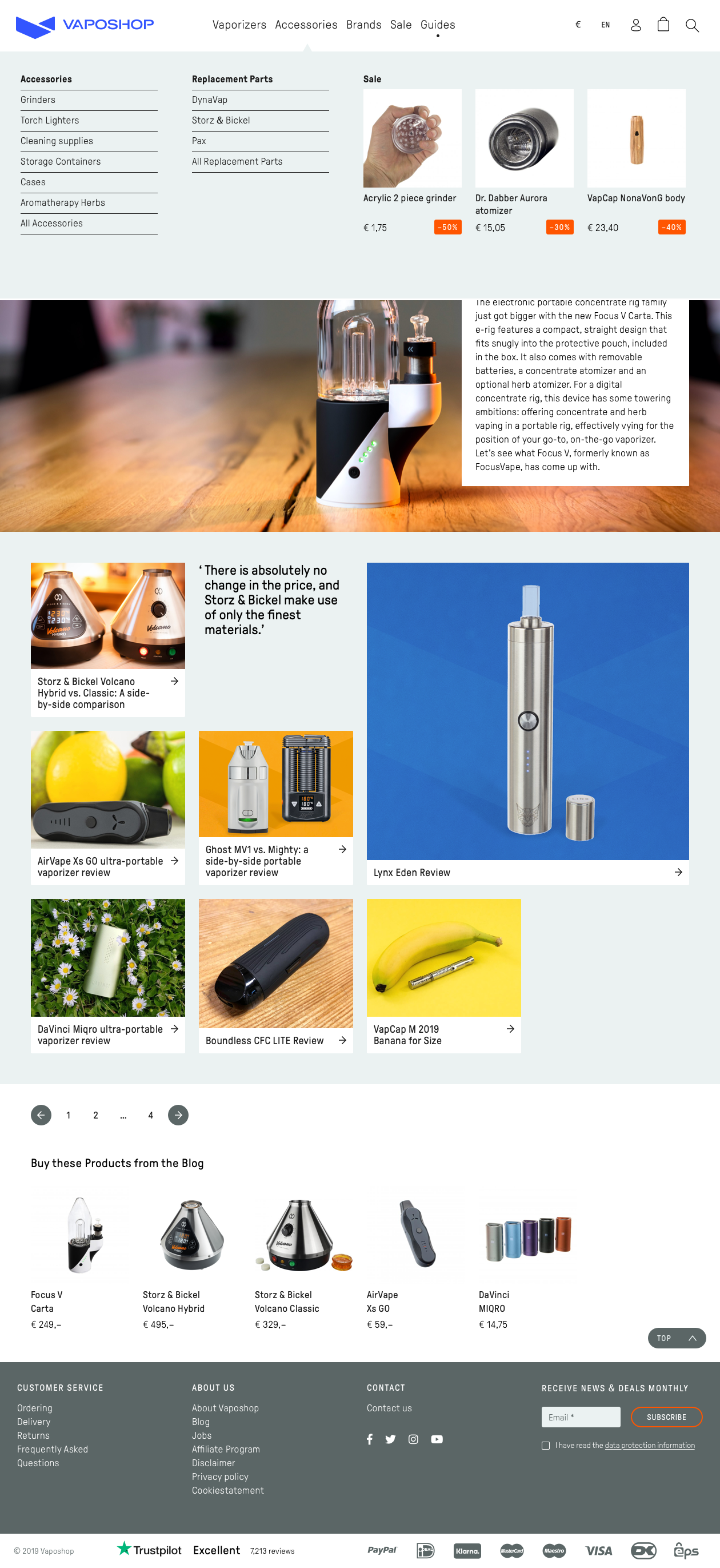
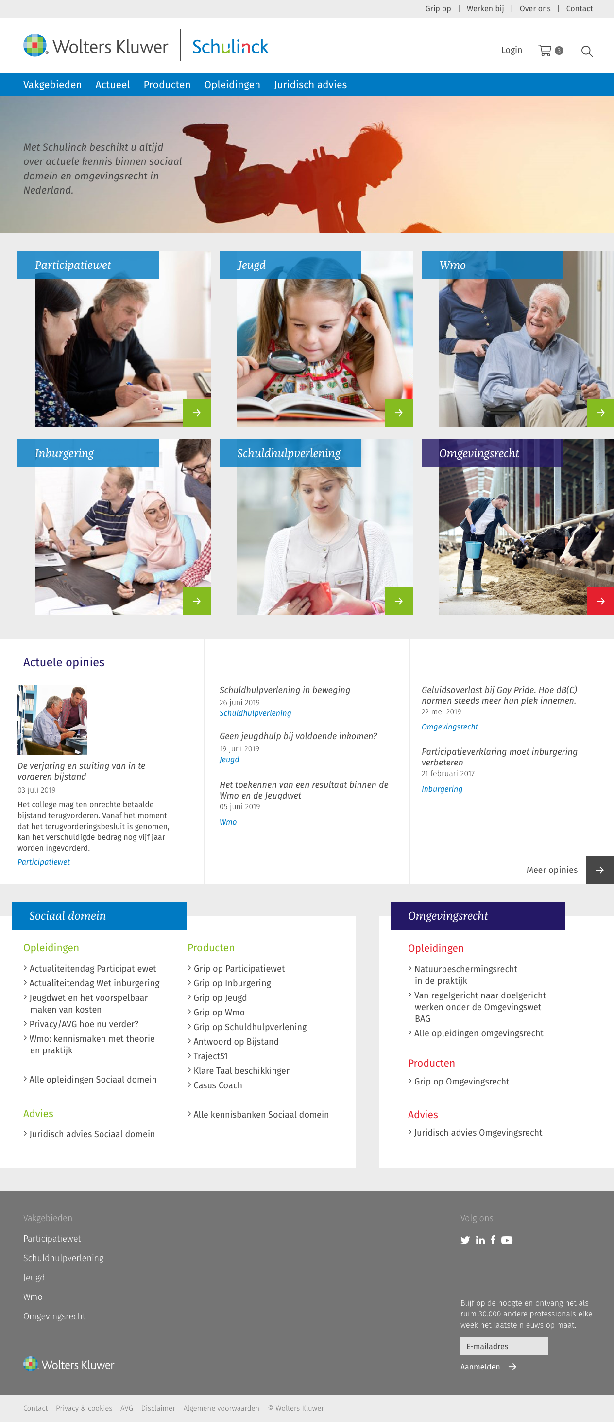
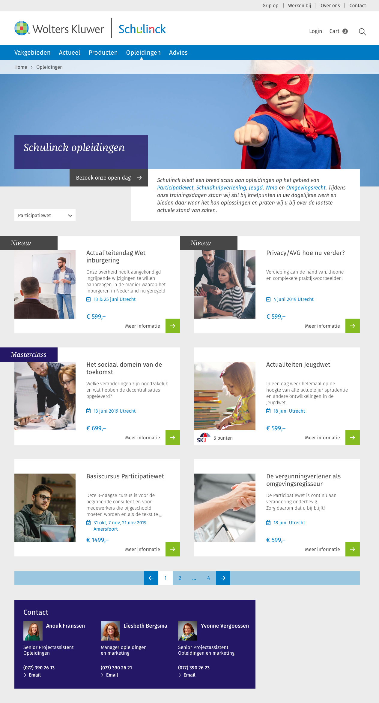
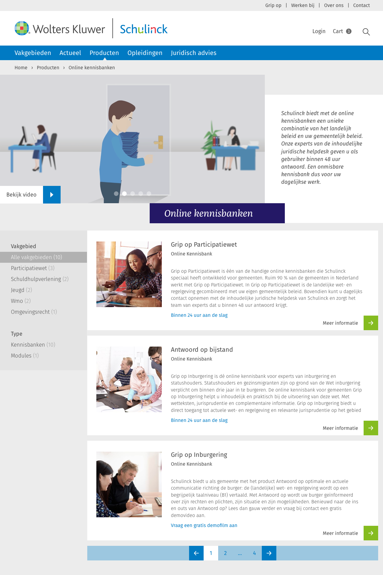
To enable consistent navigation we introduced a mega menu: horizontal menu items with dropdown navigation. In the top level are the main products, services and areas of expertise: Knowledge Domains, News, Products, Courses and Legal Advice.
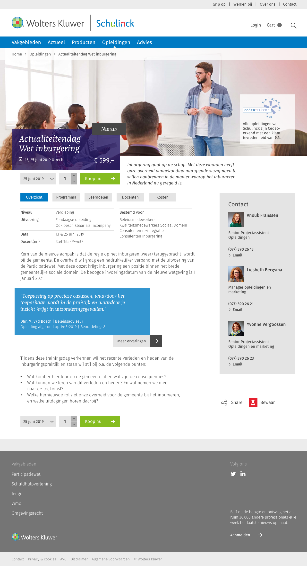
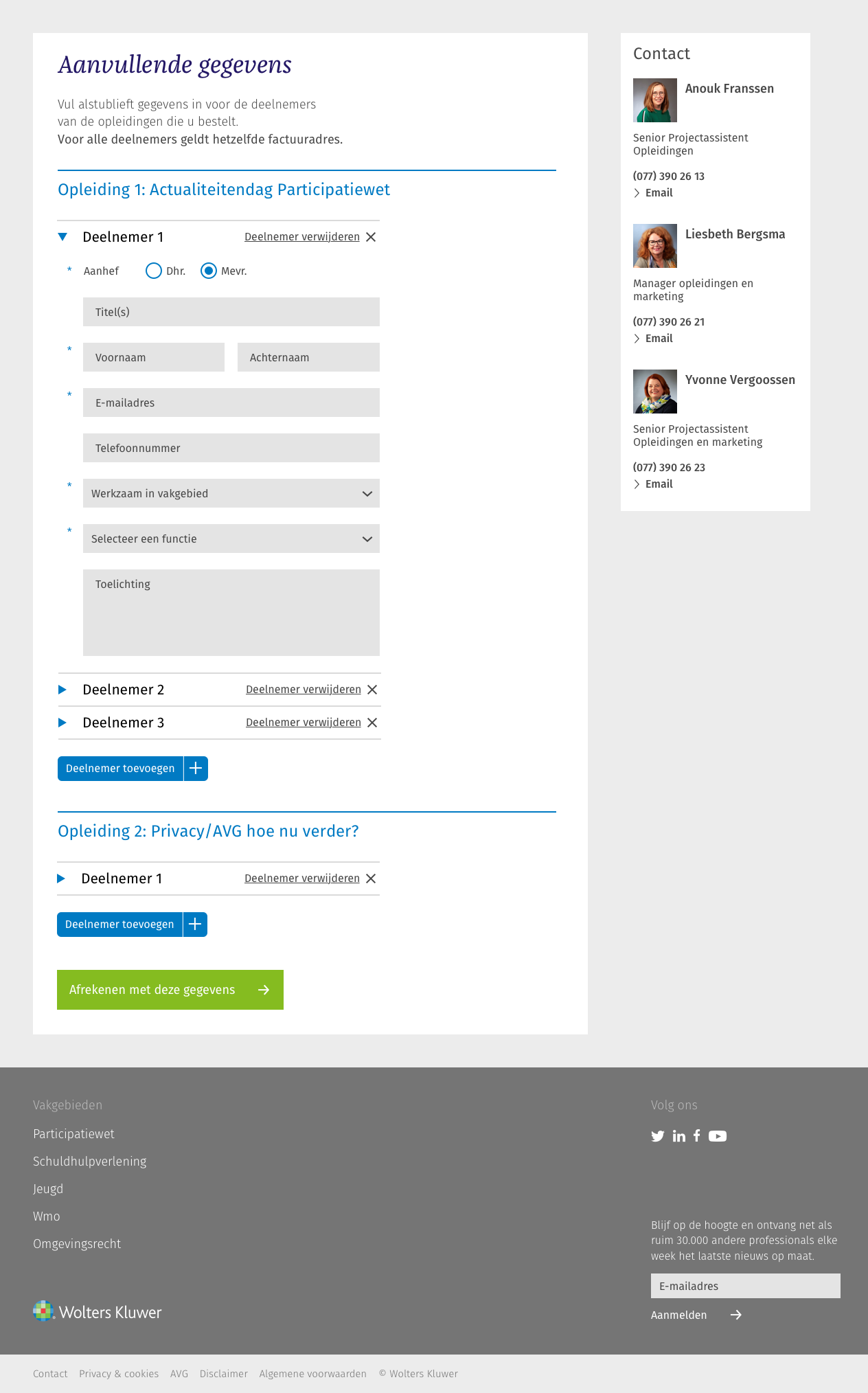
For knowledge base products, customers can apply for a trial. The form was complex and used three different steps to gather information, even if the number of fields was low. We changed it into a one page form and streamlined the onboarding flow by adding a clear Call to Action on the product page.
User Research
To test assumptions early in the process, we created a test model containing the new navigation and a partial model of the site containing a selection of important pages like course index and detail view, product index and detail view, and knowledge domain portal pages. We then setup a task analysis for a group of about 30 current customers.
The results gave insight into which of the design choices worked, and which did not. Some changes we made:
- Because too many respondents could not find the news letter subscription box in the footer, we added a box to each news article and blog, and several links on different panes in the mega menu.
- Since many respondents were not aware what an infographic is, we choose to show latest infographics on domain portal pages.
E-commerce
Customers were directed to the general Wolters Kluwer shop for ordering. Thus they were less likely to continue browsing the Schulinck site, and they had a fragmented buying experience.
This was especially true for courses, where extra information is needed from participants.
By integrating the cart and checkout within the website we could streamline the customer experience and make it easier for Schulinck to collect exactly the information they needed. Normal products have a simple checkout flow, while courses have an additional step where users can enter information of all course participants.
Tools used Sketch, Zeplin
CMS Stack WordPress with WooCommerce
- 2019
Shopworks - Services
UX research;
Visual design;
UI development - Platform
WordPress
Visit
